
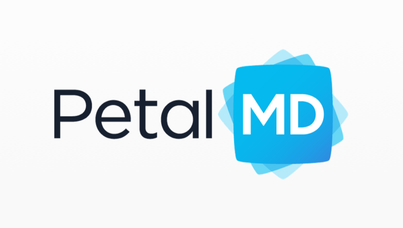
Those of you who follow us on social media or use our mobile app on a daily basis have probably already noticed : the PetalMD logo has just changed! The old logo, which was essentially typographic, gives way to a more colorful and modern visual effect that ensures continuity with our mobile application icon.
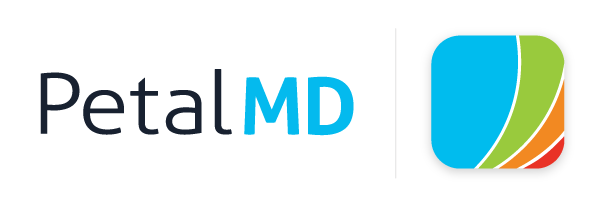
Before
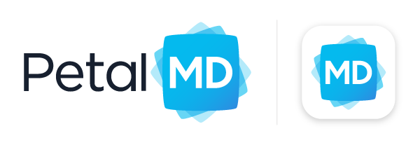
Now
Creating Solutions Around Physicians
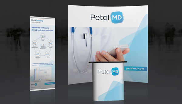
The new logo reaffirms PetalMD's primary mission by putting forward the fact that physicians (Medicinae Doctor or MDs) are always at the heart of what we offer. Our solutions exist to free up time for MDs, while at the same time helping hospitals and medical clinic managers improve the efficiency of the healthcare system.
Highlighting the Innovative Nature of our Company
Innovation is one of PetalMD's core values. Nearly 10 years after our founding, we continue to develop technologies that meet the latest challenges in the healthcare system.
This explains why the blue squares of our new logo – which symbolize the different solutions developed by PetalMD – are repeated with a slight rotation. The movement effect is meant as a reference to the constant, innovative mindset at PetalMD.
.png?width=600&height=100&name=blog74_3timeline1%20(1).png)
Trusting In-house Talent
Many companies choose to do business with external agencies when it comes to revamping their logo. Not PetalMD : we have chosen to trust our internal talent and from the result you can see it’s a good thing we did. We value our in-house talent and thus want to highlight the excellent work of our graphic designer, who created a visual identity true to PetalMD’s core values while at the same time producing many great variations.
Want to join our team?
Check out the available jobs and send your curriculum vitae to jobs@petalmd.com! We look forward to meeting you.

