Medical clinics that use Petal Booking will be pleased to hear that our analytics dashboards are finally available! This new feature comes in direct response to the needs of a growing number of managers who want to measure and optimize online or in-clinic appointment management.
These new dynamic reports provide a quantitative snapshot of several elements, including patient wait times, peak times, the most popular appointment booking channels, the number of appointments, unused time slots, excess requests, etc.
Used correctly, this data can optimize the distribution of available staff and improve access to healthcare. These new analytics features were designed to help managers make informed decisions and to provide visibility into online portal usage statistics.
Here are some of the newly accessible dashboards. For a complete list, download the PDF document.
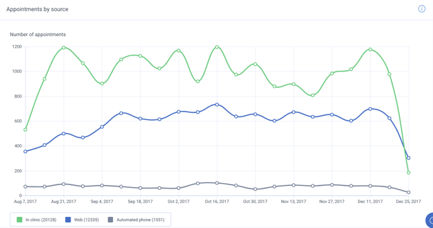
Number of appointments by source

How much more popular is booking appointments online compared to over the phone? Are the phone lines busier during a specific time of the week, month or year?
This chart lets the medical clinic see how many appointments came from each source (online, in-clinic, automated phone line or other). The data can be displayed by time period, by type of appointment and by health professional.
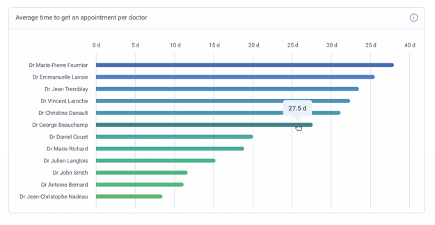
Average wait time to meet a physician

How long do patients who want to see a physician have to wait? Are wait times especially short or long for a particular type of appointment?
This chart displays the average wait time between the moment patients make an appointment and the date they meet a physician depending on the time period and type of appointment selected.
Exemple of a way to leverage this data
The average time for a medical follow-up with Dr. Robinson is 35 days, and the targeted wait time for this type of appointment is 20 days based on the clinic’s internal policies. Using this data, the clinic can adjust Dr. Robinson’s availability—for example, by increasing the ratio of available time slots for this type of appointment.
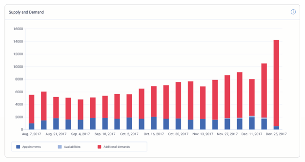
Appointment supply and demand

How many time slots were available for one type of appointment but weren’t filled due to insufficient demand? Conversely, what types of appointments face excessive demand that exceeds the clinic’s current capacity?
This chart makes it possible to visualize the ratio between the number of filled and unfilled time slots and excess requests. Excess requests represent the number of time slots that would have been necessary to meet patients’ needs. The data can be displayed by time period, by type of appointment and by health professional.
Exemple of a way to leverage this data
In recent weeks, the time slots reserved for Dr. Robinson’s emergency appointments never get completely filled. On the other hand, requests for medical follow-ups often exceed available time slots. To improve access to healthcare, it may be worthwhile to cut the number of time slots reserved for emergency appointments and offer more for medical follow-ups. This chart helps determine how many time slots can be transferred to medical follow-ups without preventing patients who come in for emergency appointments from receiving care.
See all available dashboards
To see all available dashboards and find out how the data provided can improve a medical clinic’s performance, download the PDF document by clicking below!
